In this guide
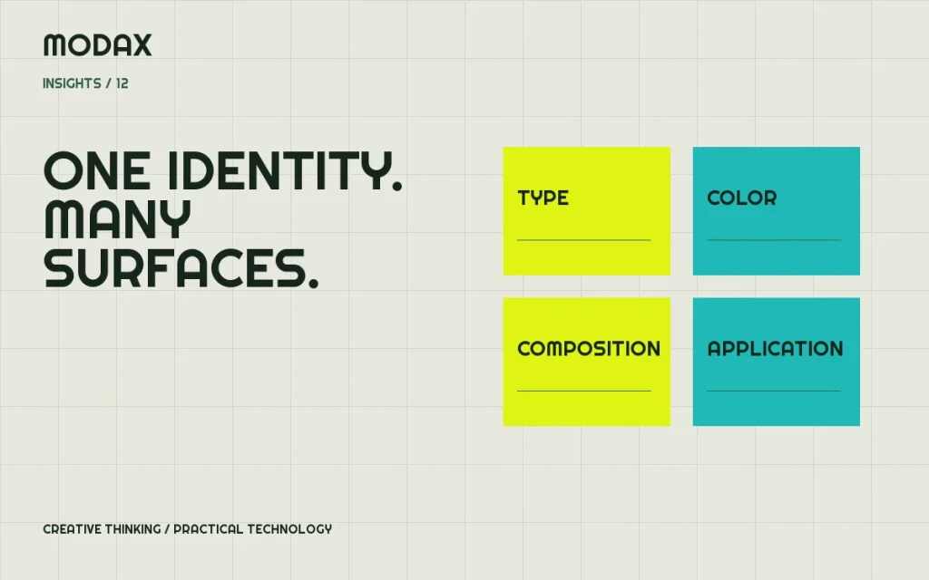
A logo can introduce a brand, but it cannot make every future decision on its own. A usable identity system explains how the business presents itself across a website, a social post, a product label and the ordinary documents people encounter along the way.
Begin with the environments where the identity must work. A tiny avatar, a busy product shelf and a long-form website each place different demands on typography, color and composition. Design for those demands before collecting attractive mockups.
Positioning gives the visual system a job
Describe the audience, the product or service, the useful difference and the tone the business can credibly sustain. Avoid positioning that depends on unverified superlatives. The visual identity should help people recognize and understand the business, not compensate for an unclear offer.
Write a small set of practical attributes and test them against real applications. “Expressive” can mean an unexpected headline composition while body text remains straightforward. “Technical” does not require pretending every interface is a terminal.
Build a logo system, not an oversized master file
Consider the primary mark, compact variant, wordmark and appropriate single-color versions. Test them at realistic sizes, against light/dark surfaces and in constrained placements. Specify minimum sizes and clear space based on legibility rather than an arbitrary decorative rule.
Keep the editable source and approved export files organized. Identify which versions should be used for web, social and production artwork. A flattened screenshot of the logo is not a dependable master asset.
Give typography clear roles
Assign display, heading, body and utility roles. An expressive display face may work well for a short headline but poorly for a dense paragraph or small product details. Define a hierarchy that supports both personality and reading comfort.
Confirm font licensing and the formats required for each application. Check what happens when the intended font is unavailable. For web use, consider loading behavior, fallback metrics and whether every requested weight is necessary.
Define a color system with accessible combinations
List core colors, supporting colors and their roles. Test actual text/background combinations and interactive states; a vibrant brand color does not automatically work for small text on every surface. The WCAG contrast guidance explains the minimum text-contrast requirements and important distinctions for text size.
For print, coordinate color specifications and proofs with the production provider. A screen preview cannot establish how a material, ink or finish will reproduce. Treat physical proofs as evidence, especially where small text or fine lines are important.
Let composition adapt to the surface
| Surface | Identity questions to test |
|---|---|
| Website | Does hierarchy survive mobile, long copy and interactive states? |
| Social | Is the mark recognizable in a small avatar and the message legible in-feed? |
| Packaging | Do hierarchy and product information work at physical size? |
| Presentations/documents | Can ordinary staff create consistent, readable pages? |
Consistency means related decisions, not identical layouts everywhere. A campaign image, product page and label can share typography, palette and graphic language while using different compositions.
Packaging needs both expression and production discipline
Work from the correct dieline and specifications. Establish information hierarchy, dimensions, bleed, safe areas and export requirements with the printer or manufacturer. Keep required product information accurate and distinguish design approval from legal or regulatory approval.
Do not copy mandatory labeling assumptions from another product category or jurisdiction. The responsible business and qualified advisers should supply and verify required statements. The design system must accommodate that information without making it unreadable.
Make social assets useful to the person publishing them
Provide adaptable templates with clear content zones and examples for different message lengths. Include instructions for image selection, text limits and mark placement. A beautiful template that only works with one exact headline will be difficult to use consistently.
Coordinate the identity with the social media marketing process: planning, content production and community context should inform which reusable assets are actually needed. Do not assume the same crop works on every platform.
Document decisions and maintain the system
Guidelines should explain logo use, typography, color, imagery, graphic elements, tone and practical examples. Include the editable assets and explain where the approved versions live. Show common mistakes alongside correct applications when that makes a rule easier to understand.
Assign an owner for changes and a way to retire obsolete assets. Review new applications against the system instead of letting each campaign quietly establish a different identity.
Modax's brand development service connects identity work with digital applications and technical execution. Bring the current assets, the surfaces you need to support and examples of where the identity breaks down. They make a more useful starting point than a request for “a more modern logo” without context.